Description
How to interpret a pillar within an already renovated living space in a way that it can be experienced as a reinforcing and integrated element with the surrounding elements?
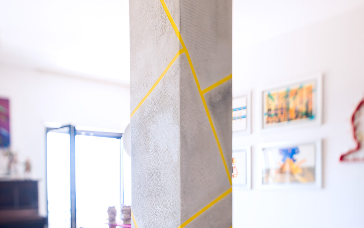
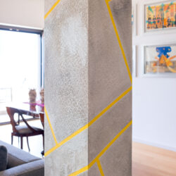
PASSOADUEDESIGN embraced the challenge! The design concept was to make it a focal point by seamlessly integrating it with the surrounding environment. In the pre-existing living area, there are numerous contemporary artworks, a passion of the homeowners. Therefore, the study of colors and the lines from various perspectives in the space served as the starting point for the design reinterpretation of the column.
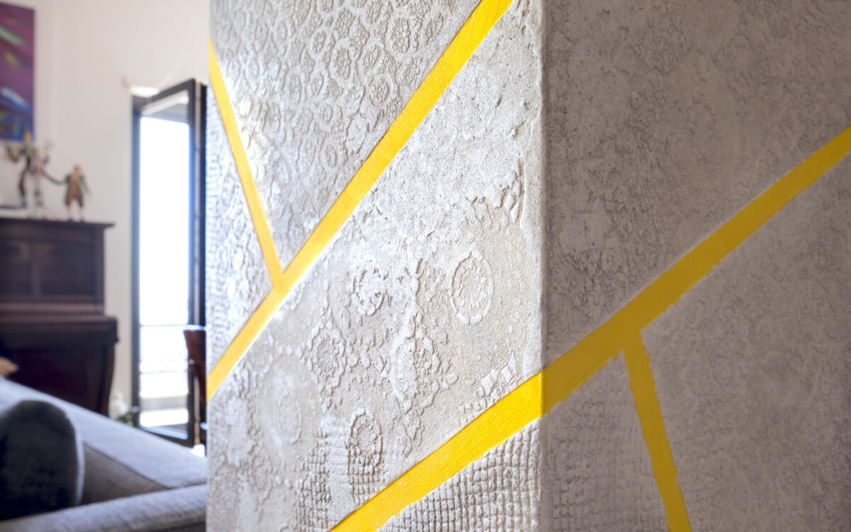
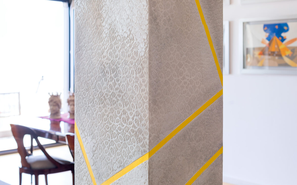
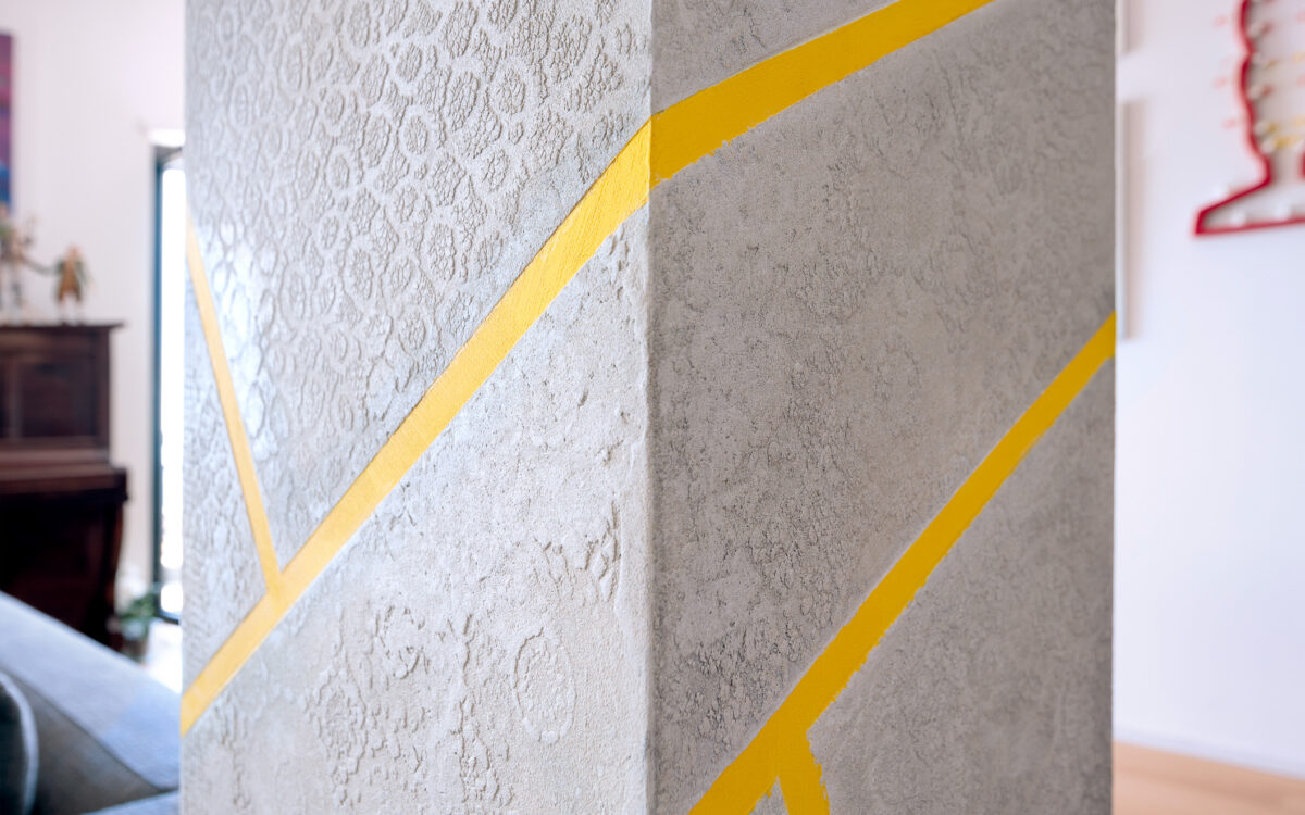
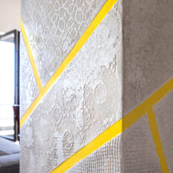
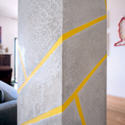
The surface was treated with a micro-cement texture coating and layers of graphite powder patinas.
The geometry of the enveloping lines, which, like a continuous ribbon, extends across the four faces of the column, breaks down the overall structure and disrupts the verticality of the column. The ribbon was painted in an ocher yellow color, in complete harmony with the existing artworks on the walls. The objective was to create a strongly characterizing image for the space, consistent in terms of image, color scheme, and lines. The result is an artistic design element that seamlessly harmonizes with the living area 
